
Under the hood
How I built this.
No template. Every effect on this site is written by hand, and below you get to push the buttons yourself.
Glass that really bends light
A plain blur isn't Liquid Glass. For every size I compute a displacement map from the distance to the rounded edge. The middle stays calm and the rim bends the background hard, with a different strength per colour channel for the faint prism edge. Go ahead and drag the glass around.
// Per size: bend hard at the rim, leave the middle alone.
const strength = (1 - inside / edge) ** 2.2;
dx = (-nx / length) * strength;
image.data[i] = 127.5 + dx * 127.5;

el.style.backdropFilter =
`url(#${filterId}) blur(5px) saturate(175%)`;Only Chromium renders an SVG filter in backdrop-filter. Safari and Firefox deliberately get a frosted variant.
Transitions between screens
Open a project on the home page and the card grows into the page. That's no animation library, but the browser's View Transitions API through React. Both screens get the same name and the browser animates the difference. Try it here in miniature.
<ViewTransition name={`app-${slug}`} share="app-open">
  <Link href={`/work/${slug}`}>…</Link>
</ViewTransition>One number drives it all
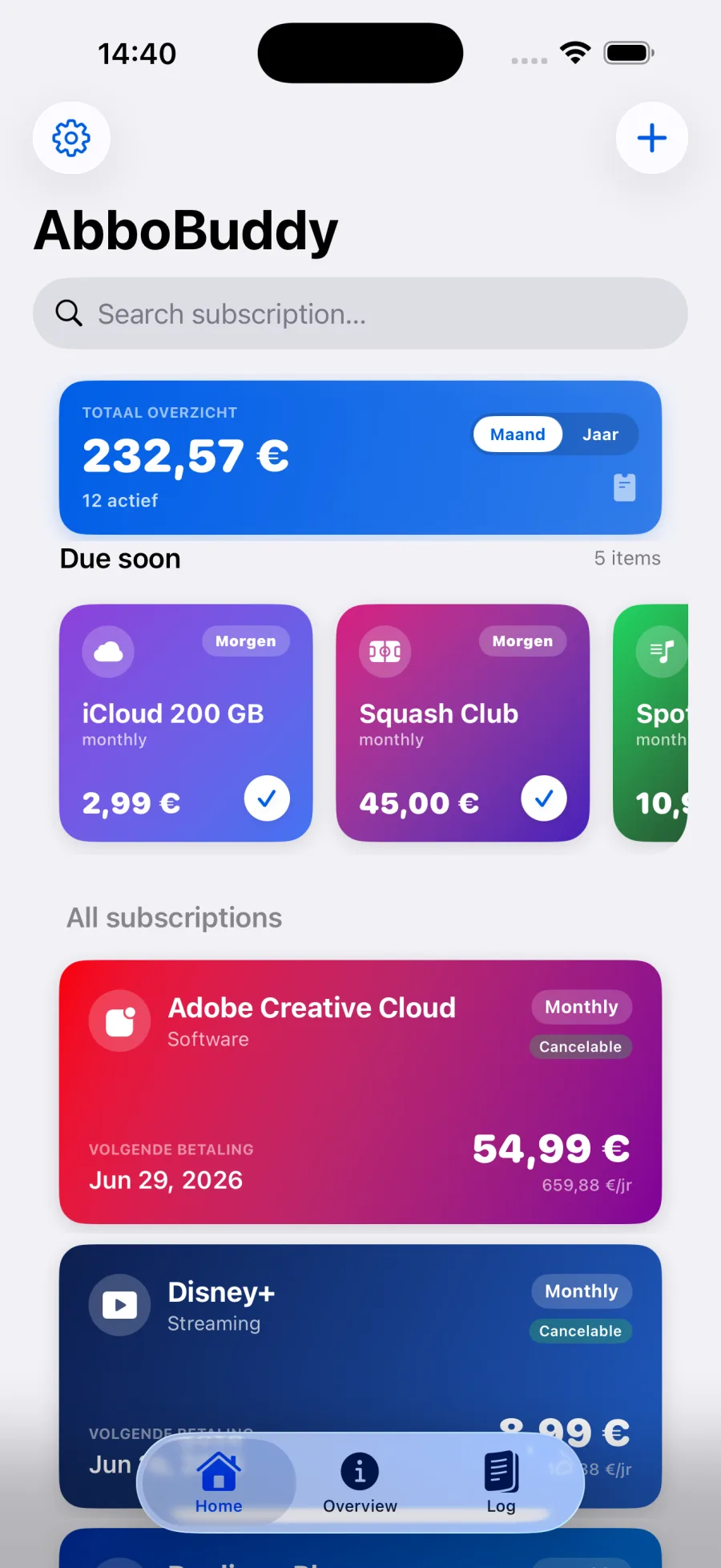
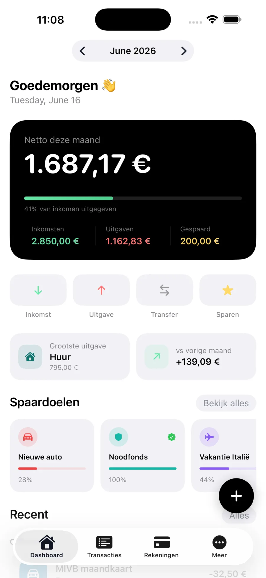
The iPhones in the hero fan out as you scroll. I write one value to CSS, --p from 0 to 1, and calc() works out every position. React doesn't re-render anything. Drag the slider: this is the same technique.
// Once per frame, and React never hears about it.
track.style.setProperty("--p", progress);

transform: translateX(calc(var(--p) * -95%))
           rotate(calc(var(--p) * -7deg));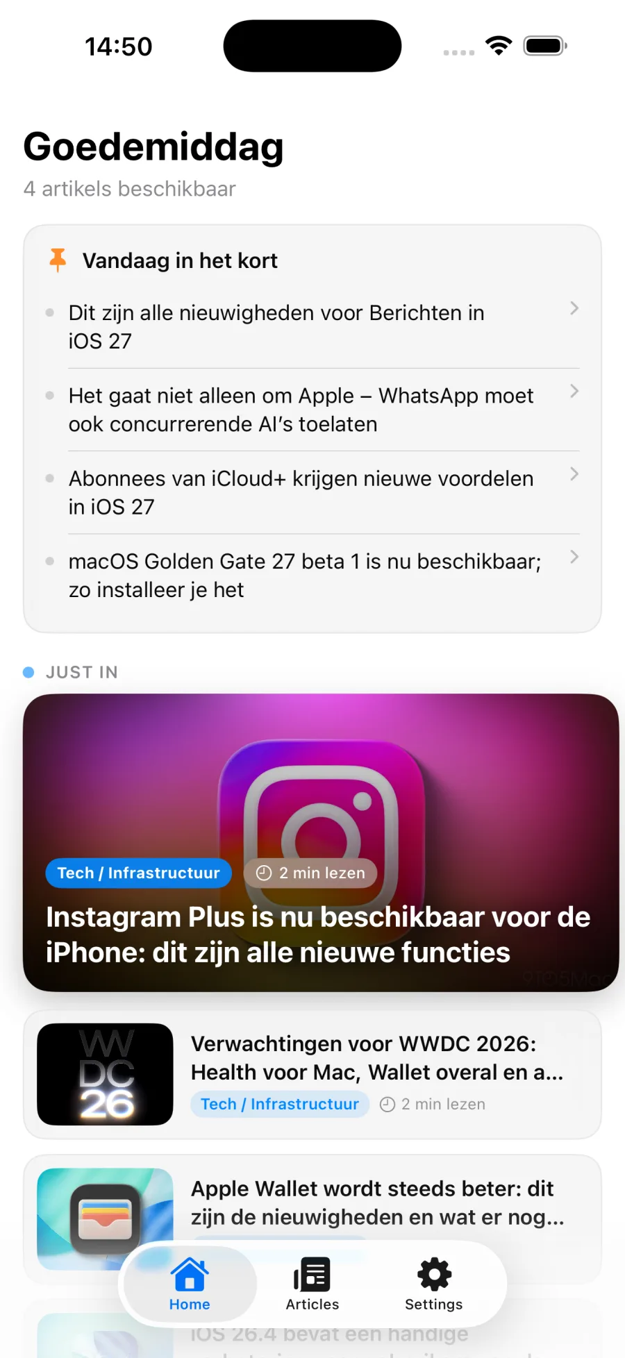
And without JavaScript
Blocks that appear as you scroll run on animation-timeline: view(). The browser handles that entirely by itself. Scroll inside this frame.
.reveal {
  animation: reveal-in linear both;
  animation-timeline: view();
  animation-range: entry 5% cover 28%;
}Motion with weight
Apple interfaces overshoot a little. CSS has no spring function for that, but linear() can approximate any curve. So everything gets the same spring without JavaScript.
--spring: linear(0, 0.009, 0.035 2.1%, 0.141,
0.281 6.7%, 0.723 12.9%, 0.938 16.7%, 1.017, …);ease--ease-out--spring
Measured, not promised
All those animations and glass effects mustn't make the site slow or hard to read. So I measure with Lighthouse, on a simulated mid-range phone with a slow connection.
Mobile
- 82Performance
- 96Accessibility
- 100Best practices
- 100SEO
Desktop
- 100Performance
- 96Accessibility
- 100Best practices
- 100SEO
Lighthouse 13.6.0, home page, median of 3 runs per device on the production build with compression, 17 November 2026. Every deploy measures again and is blocked when a score drops below budget.
Built with
Next.js 16
Fully statically exported: no server, just files.
React 19
The <ViewTransition> component behind the app transitions.
TypeScript
All content is typed and bilingual, so a missing translation breaks the build.
Tailwind CSS 4
Plus custom design tokens and materials in CSS layers.
The design system
Every colour, size and duration on the site comes from these tokens.
Colour
--paper--paper-raised--ink--ink-soft--rule--signal
Typography
- Aa
--font-size-hero - Display
--font-size-display - Title
--font-size-title - Body
--font-size-body
Motion
--duration-fast · 140ms--duration-base · 320ms--duration-slow · 700ms